Project
02
Publishing · 2025
Tejo Press.
A small press, a long view.
Services
Identity
Web
Editorial
Project · Statement
§
Tejo Press believes in slow publishing. The system we built around them is built to age — typographic, restrained, generous with whitespace.
Year
2025
Sector
Publishing
Disciplines
Identity, Web
Recognition
TDC Editorial

Chapter 01
A press, not a brand
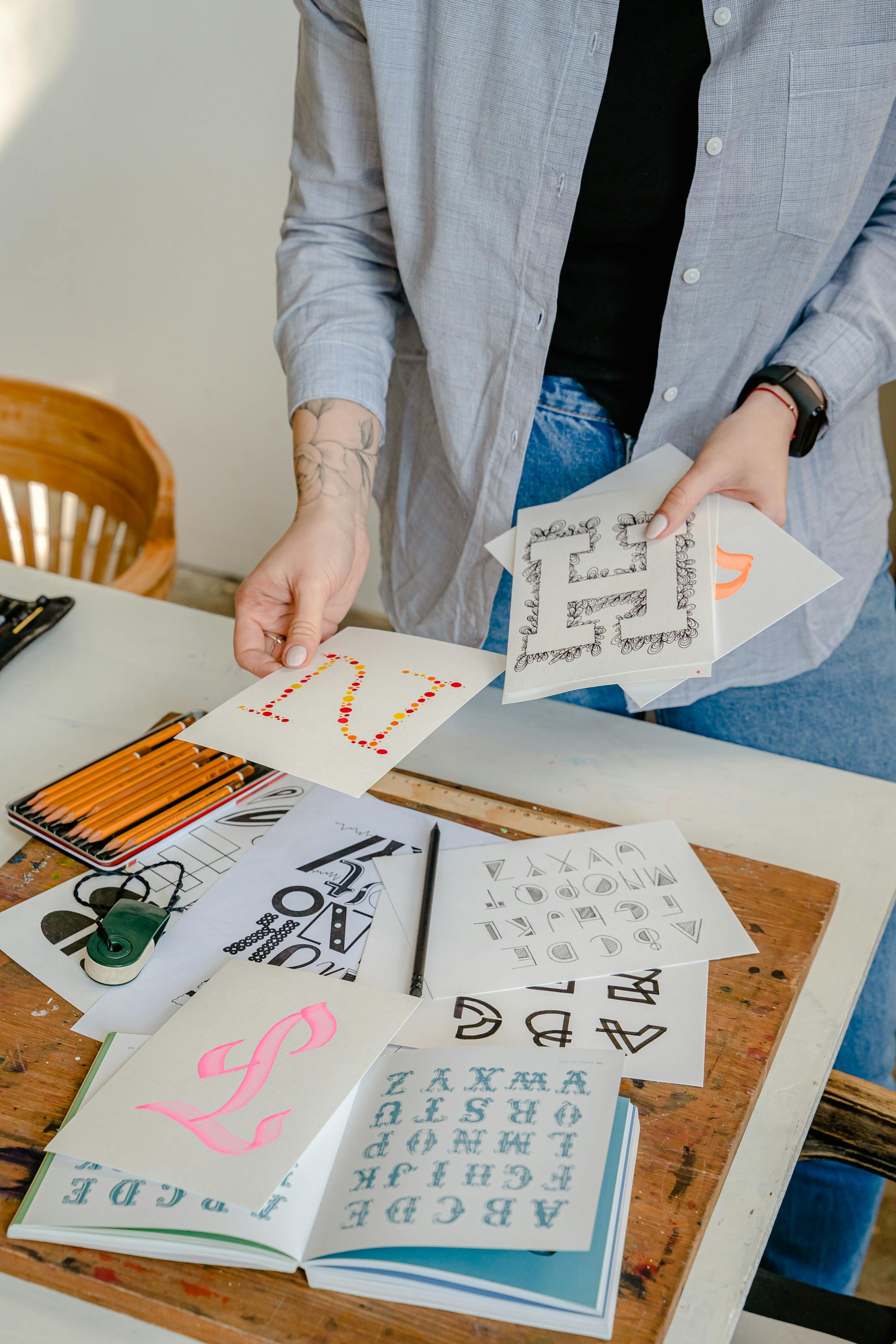
Tejo wanted no logo, no avatar — only a typographic mark that could move freely between a spine, a stamp, and a signature. We delivered a six-glyph set, hand-cut, that the team uses as both wordmark and ornament.

Chapter 02
Reading on screen, finally
The site is built around a long-form reader. Footnotes drop into the margins on large screens, slide up on small ones. Page weight averages 68 KB — the goal was that a reader on the Lisbon-Faro train could finish a chapter on a single bar of signal.
"The studio became a quiet outlier. We can read our own website. Our clients can too."